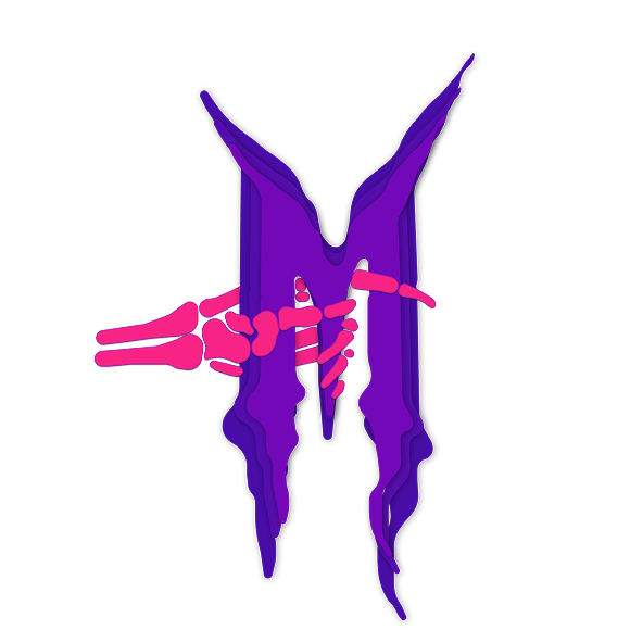
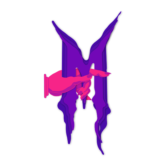
Iterative Design

You explore and use professional design tools and you iteratively design visual works.

Note: You can click on each image to make it bigger.

Dana Logo

First Version Presented

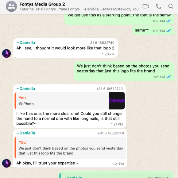
This is the initial version of the logo that my group and I presented, which I personally designed. After receiving feedback from Chris and having further discussions within the group, we agreed that some adjustments were necessary. We chose a new color palette and replaced the human hand with a skeleton hand to better align with the aesthetic and identity of our branding client, Dana.
What Went Well
I had the opportunity to practice and refine my illustration skills.
Challenges
Creating the drawings was time-consuming and required significant attention to detail.
Next Steps for Improvement
I aim to complete and present version 2.0 of the logo, incorporating all the planned enhancements.

Dana Logo

Second Version

As part of the iterative logo design process for our client Dana, I created a second version of the logo based on her initial feedback. I adjusted the color palette and replaced the human hand with a skeleton hand, aiming to align the design more closely with her mysterious, horror-inspired style.
What Went Well
I was able to successfully apply feedback and overcome challenges related to vector tracing and hand-drawn illustration. Despite the changes, I stayed true to our original concept while adapting the design to reflect Dana’s aesthetic more clearly.
Challenges
Interestingly, despite the adjustments, Dana preferred the original version with the human hand. She mentioned in our chat that she envisioned a human hand with a manicure, which went against the direction we assumed she wanted. This highlighted the importance of clear and continuous communication with the client.
Next Steps for Improvement
I will move on to a third version of the logo that incorporates Dana’s updated preferences more accurately. Going forward, I’ll aim to clarify feedback before making major changes, ensuring that each iteration brings us closer to the final vision.

Dana Logo

Final Version

I finalized the logo design after several iterations, and both the team and Dana were happy with the result.
What Went Well
I was able to understand Dana’s vision clearly and create a logo we both felt confident about.
Challenges
The toughest part was using my professional judgment to guide Dana and explain why this version fit her brand best, avoiding unnecessary further changes.
Next Steps for Improvement
In the future, I’ll be more structured with client feedback by limiting iteration rounds to keep the process focused and efficient.

Portfolio

First Version

I showed Chris the illustrations I created for my homepage. Overall, he liked the style and direction, but he pointed out that some elements—specifically the chandelier—felt off in terms of proportion. He suggested resizing it to better fit the composition.
What Went Well
It was the first time I felt genuinely happy with my illustrations and confident about using them in my website. The overall style is starting to come together as I imagined.
Challenges
Positioning the elements correctly was tricky, especially when trying to maintain balance and proportion across the design.
Next Steps for Improvement
I’ll keep refining the illustrations, adjusting scale and layout where needed, and continue developing them for smooth integration into the final website.

Portfolio

Second Version

Following Chris’s feedback, I adjusted the chandelier by making it smaller, but the layout still felt slightly off. As noted in FeedPulse, he recommended either removing the left column or reducing its shadow. I chose to remove it entirely, at least for now.
What Went Well
As I continue refining and updating the illustrations, the homepage is starting to come together and feel more cohesive. The overall composition is improving with each change.
Challenges
Even with adjustments, achieving perfect balance in the layout remains difficult—there’s still a sense that something is slightly off.
Next Steps for Improvement
I’ll keep developing the design and illustrations, focusing on visual clarity and harmony to strengthen the final layout.

Portfolio

Final Version (For now :))

In the final version, I removed the left column and resized the chandelier, which significantly improved the overall look of the homepage.
What Went Well
I finally felt like I was getting closer to a complete and cohesive version of the website, and the layout started to make more visual sense.
Challenges
Creating the illustrations took much longer than expected, which highlighted some issues with time management and prioritizing tasks effectively.
Next Steps for Improvement
Next time, I’ll plan more carefully—estimating how long tasks will take and focusing on what’s essential versus what’s just nice to have.